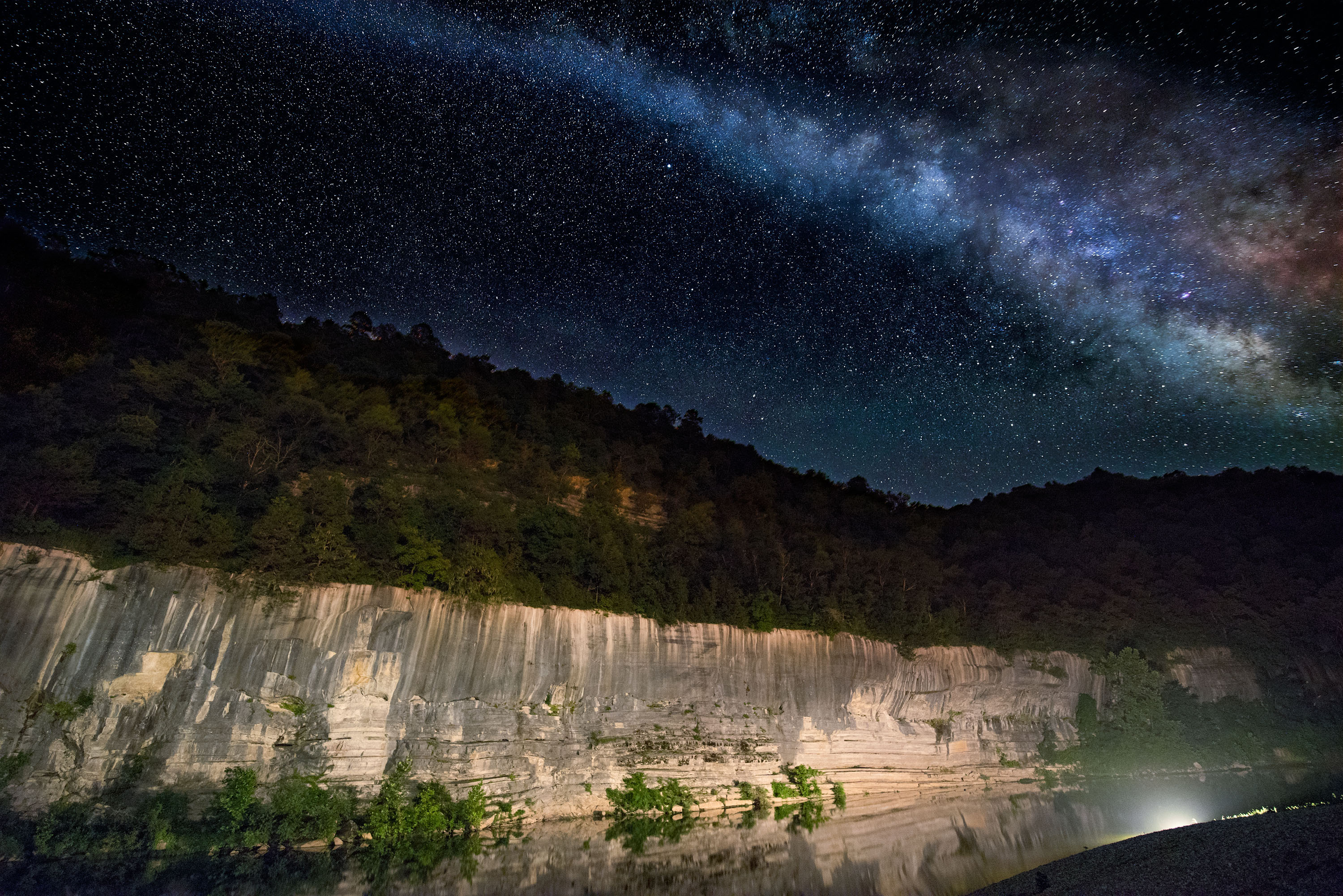
02/09/25 Color comparison of Hasselblad X2D No2–Phocus and Lightroom Snipes Bluff Buffalo River
- At February 10, 2025
- By paul
- In Articles/Reviews
 1
1
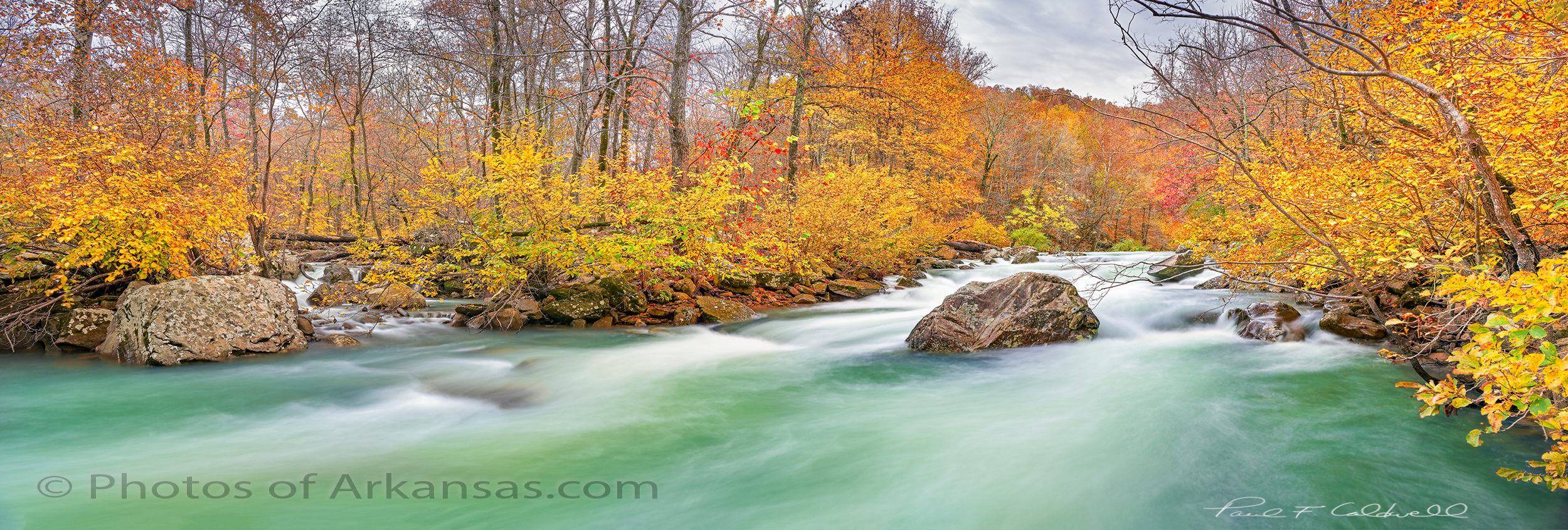
Fall colors are an excellent way to compare the color output from Phocus and Lightroom on X2D raw files. For this test, I imported the same raw file into Phocus and Lightroom and tried to keep the base work the same. I use the “camera standard” profile in Lightroom and Phocus Natural Color.
Comparison of Snipes Bluff Buffalo River Phocus and Lightroom
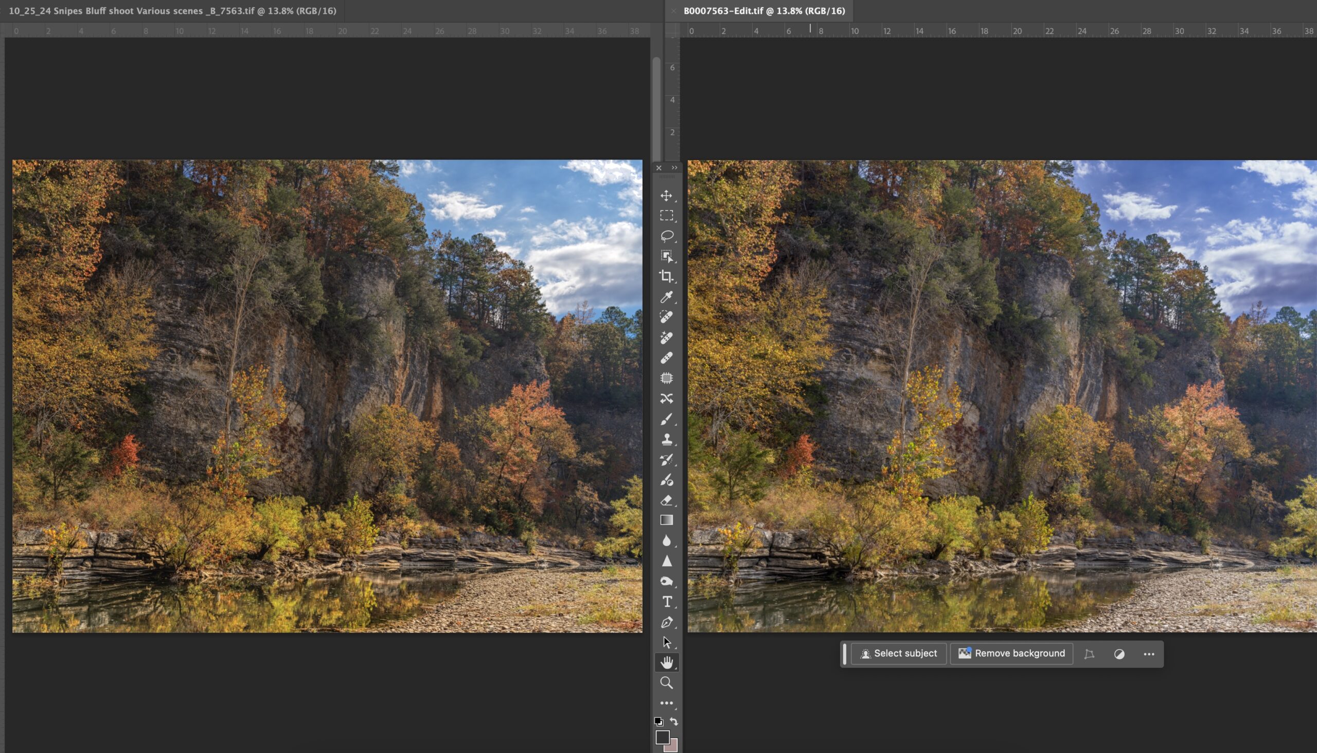
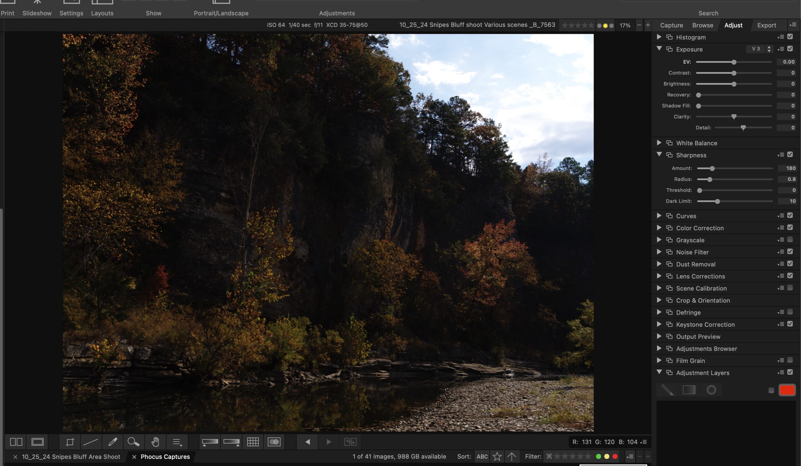
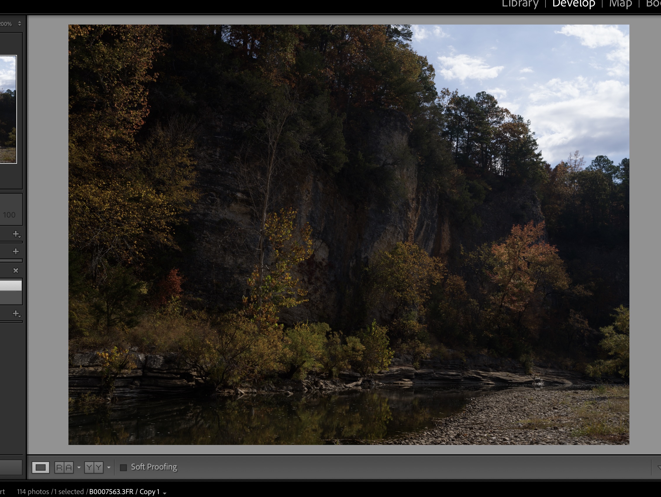
These side by side examples were screen printed from a Mac Pro M1 machine and I used Photoshop 2024 as the workbench. The Phocus output is on the left in all the examples. Shown below are screenshots showing how the raw files loaded into Phocus and Lightroom respectively without any adjustments.
-
- Screenshot
-
- Raw comparisons from Phocus and Lightroom
Click on either of the images to see them in larger view with a Lightbox.
As you can see the image was underexposed and I did this intentionally to help hold the details in the sky. I have found that the X2D is very sensitive to overexposure on highlights. Once these are blown, there is no way to recover them, whereas if you underexposure the rest of the image, you generally have plenty of room left to push up the shadows. This is true especially if you are at base ISO of 64.
Let’s look at a view closeup comparisons after working up output from Phocus and Lightroom. In this case, no additional work was done yet in Photoshop 2024 for fine tuning. All the shadow push and highlight recovery for both files was down within Phocus and or Lightroom. Additional sharpening was added to both images, again within Phocus and Lightroom. Some color work was also done. Mainly on the colors of the fall leaves using the color pickers within both Phocus and Lightroom.
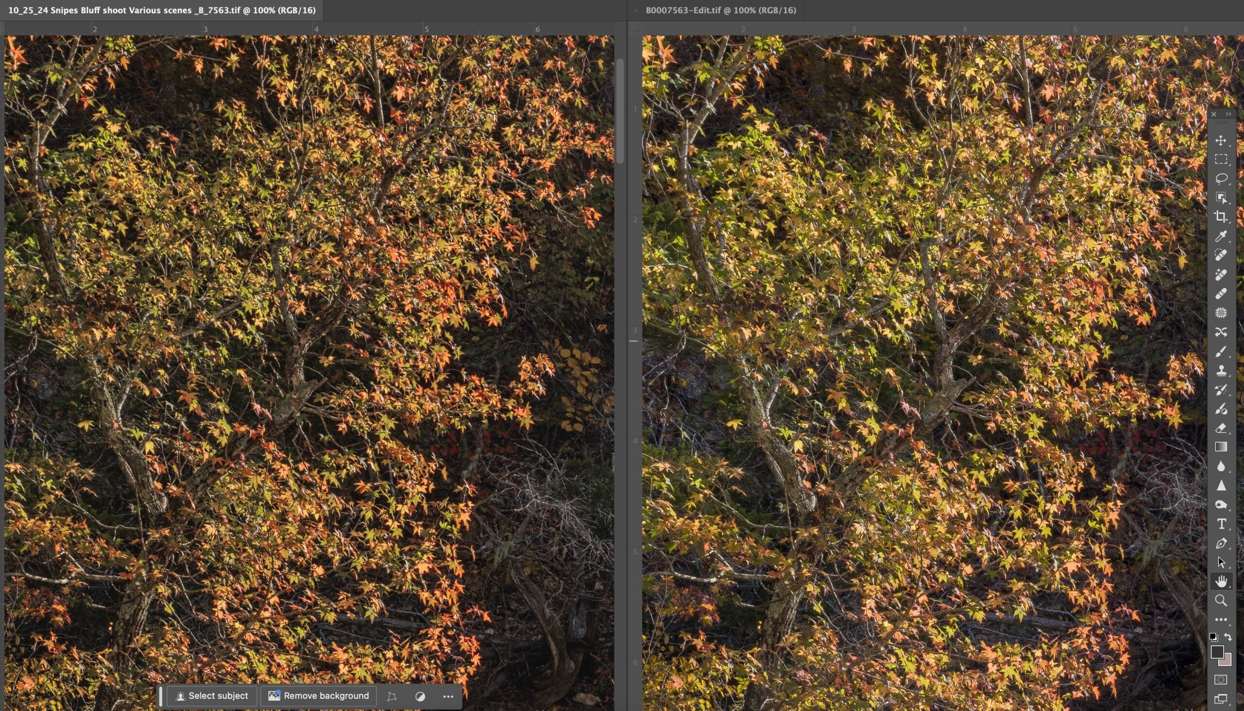
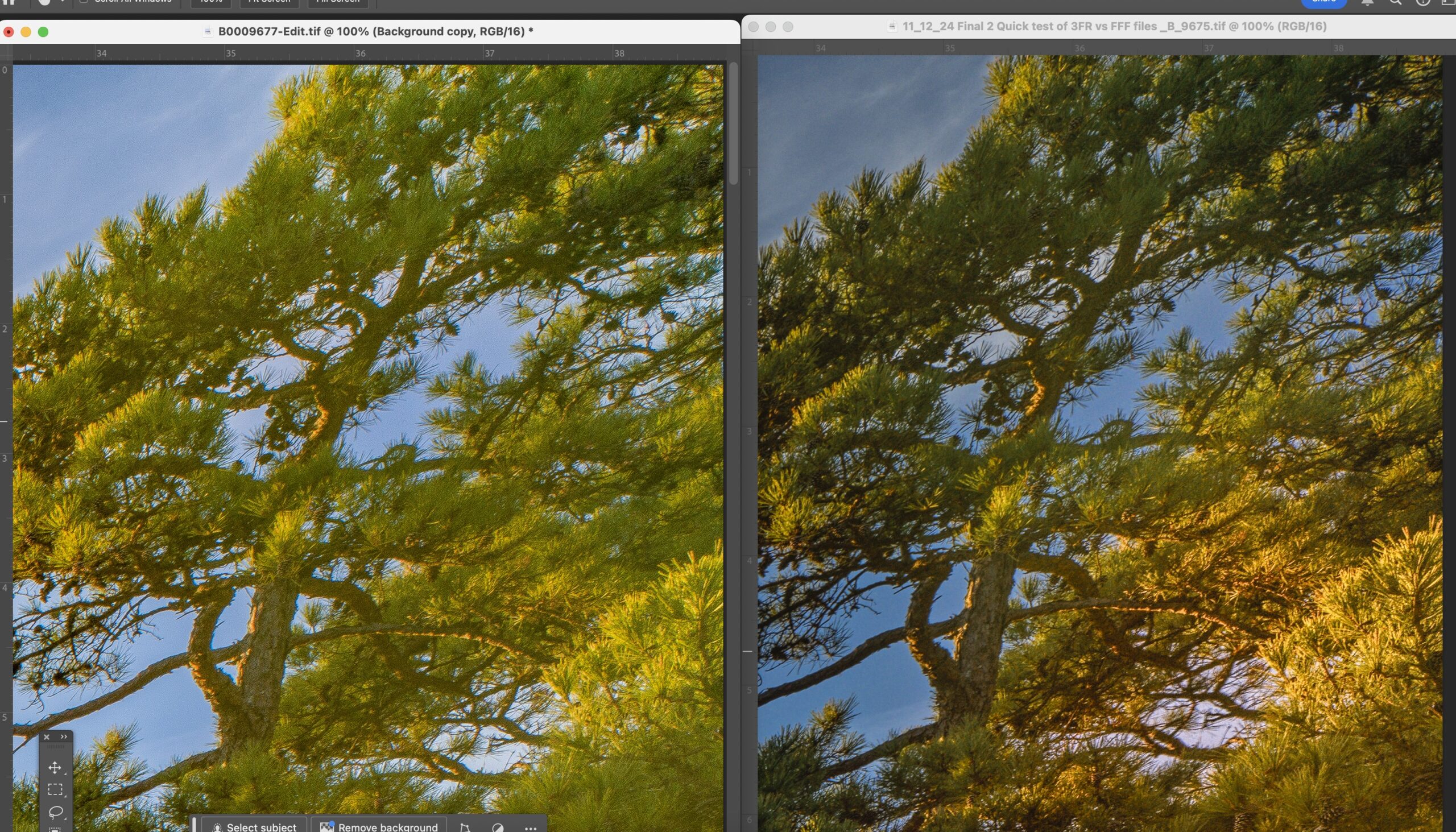
Upper left Corner comparisons for color of leaves
Albeit the two images are close, click on the image and view it in more detail. I believe you will see that the orange color of the sweet gum tree is more pronounced from the Phocus conversion. There is also what I feel is better overall versatility in the color shown in the Phocus example.
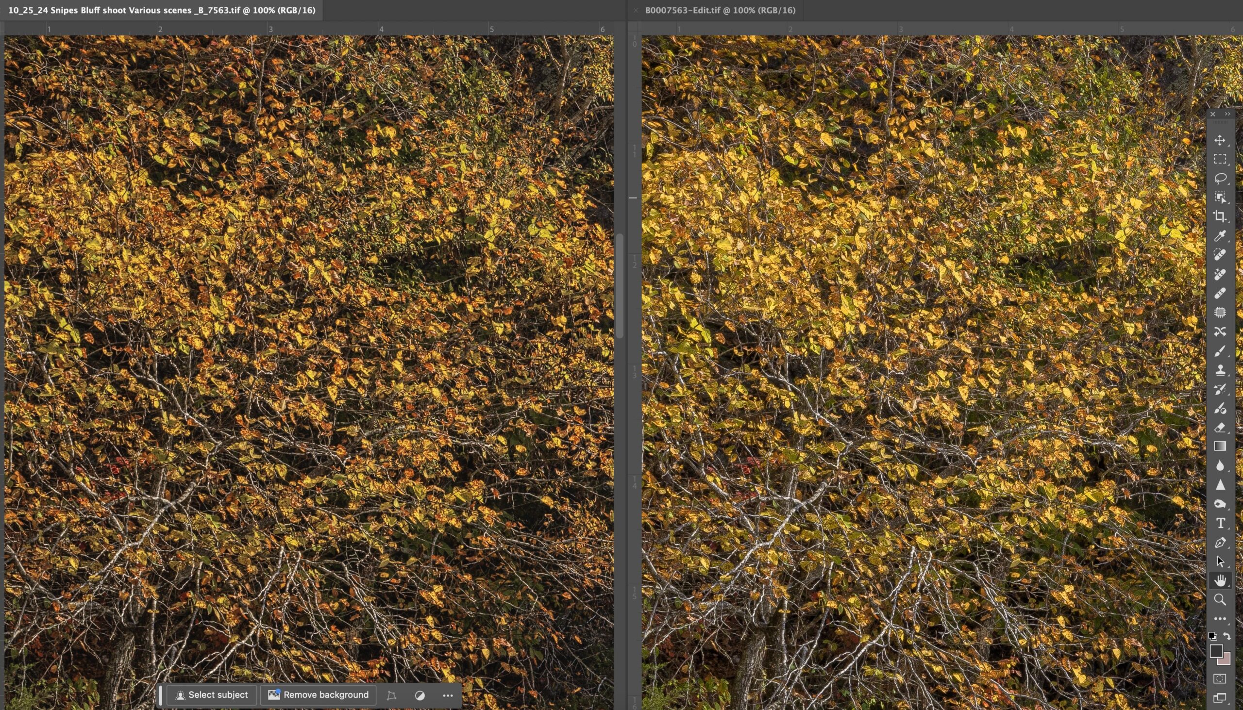
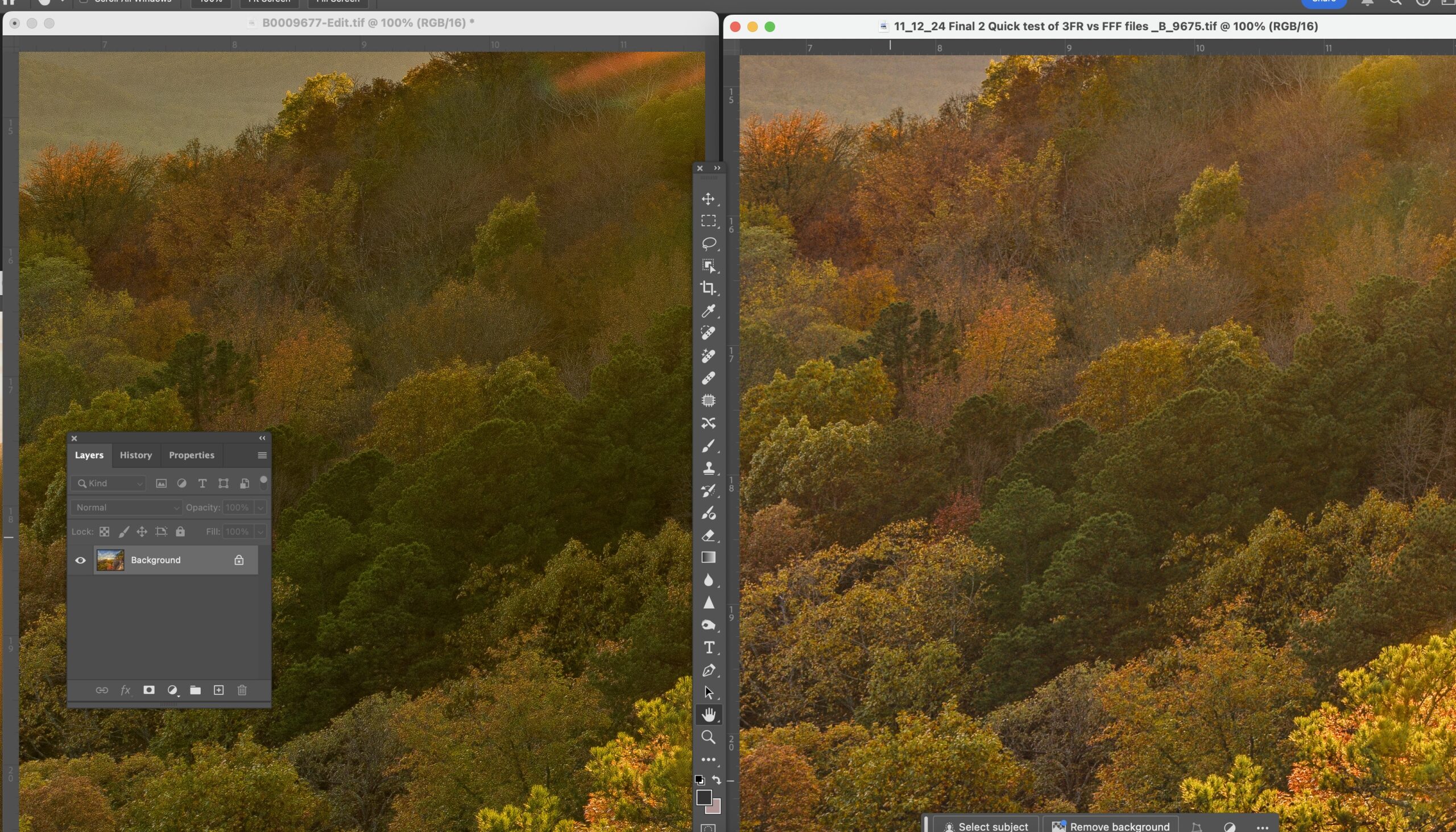
Color comparison of Phocus and Lightroom Middle left of image
Both images have nice color, however I still prefer the Phocus example. There are more variety of yellow and orange in the sweet gum leaves. Also the color is slightly less saturated on the Phocus example. It’s very easy to blow out a fall color when working with leaves. When you look at the images closely the Phocus image seems to have better definition in the edges of the leaves, where there is demarcation from orange to yellow.
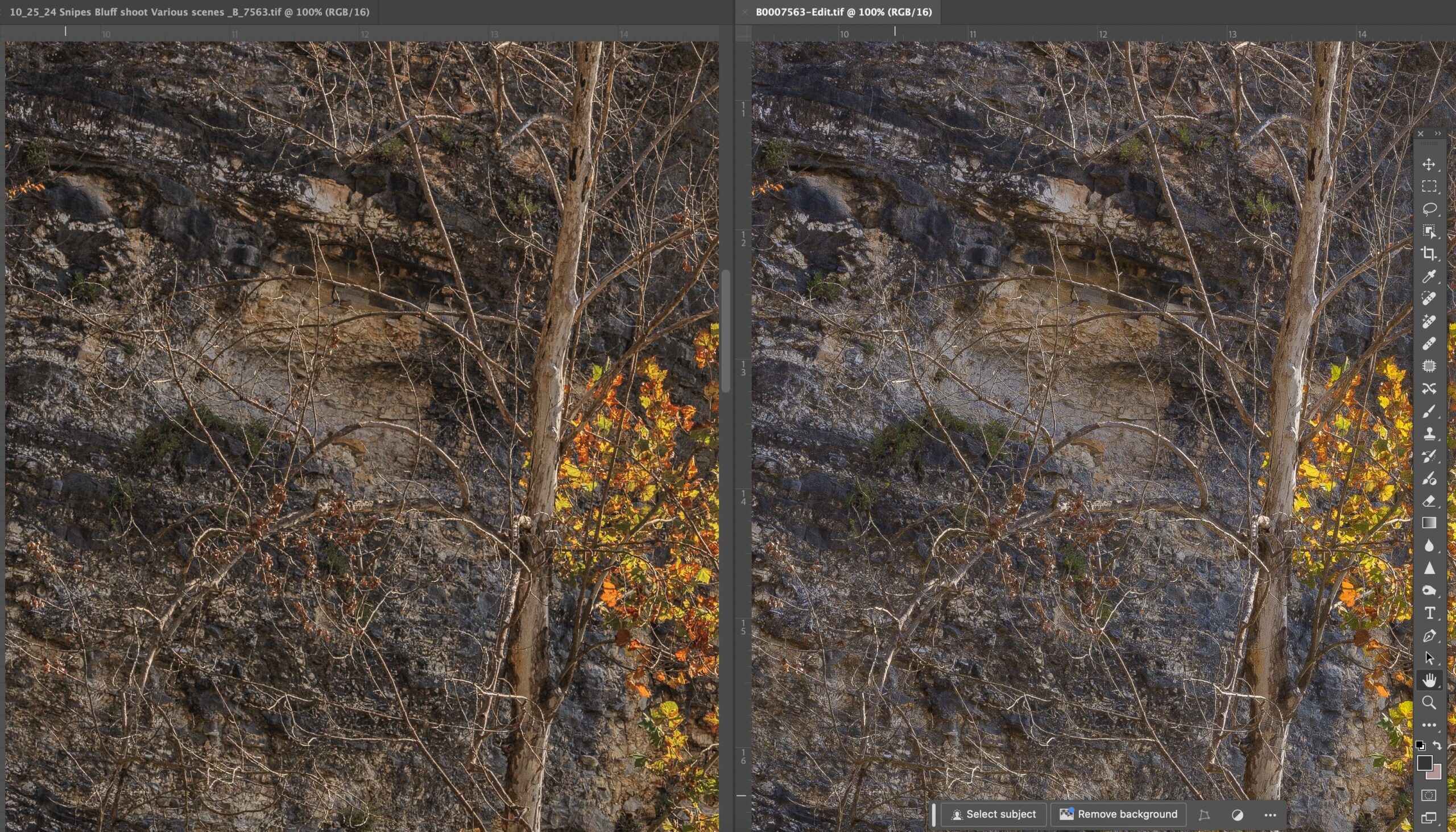
Shadow comparisons between Phocus and Lightroom
These two crops are very close with the Phocus example being slightly warmer. However once you zoom into the two, I believe you can see more demarkation in the various colors of the rock in the background. The Lightroom example seems to show slightly better shadow recovery in the dark greens of the cedar trees up against the bluff. The bark of the sycamore tree in the foreground is better defined in the Phocus example.
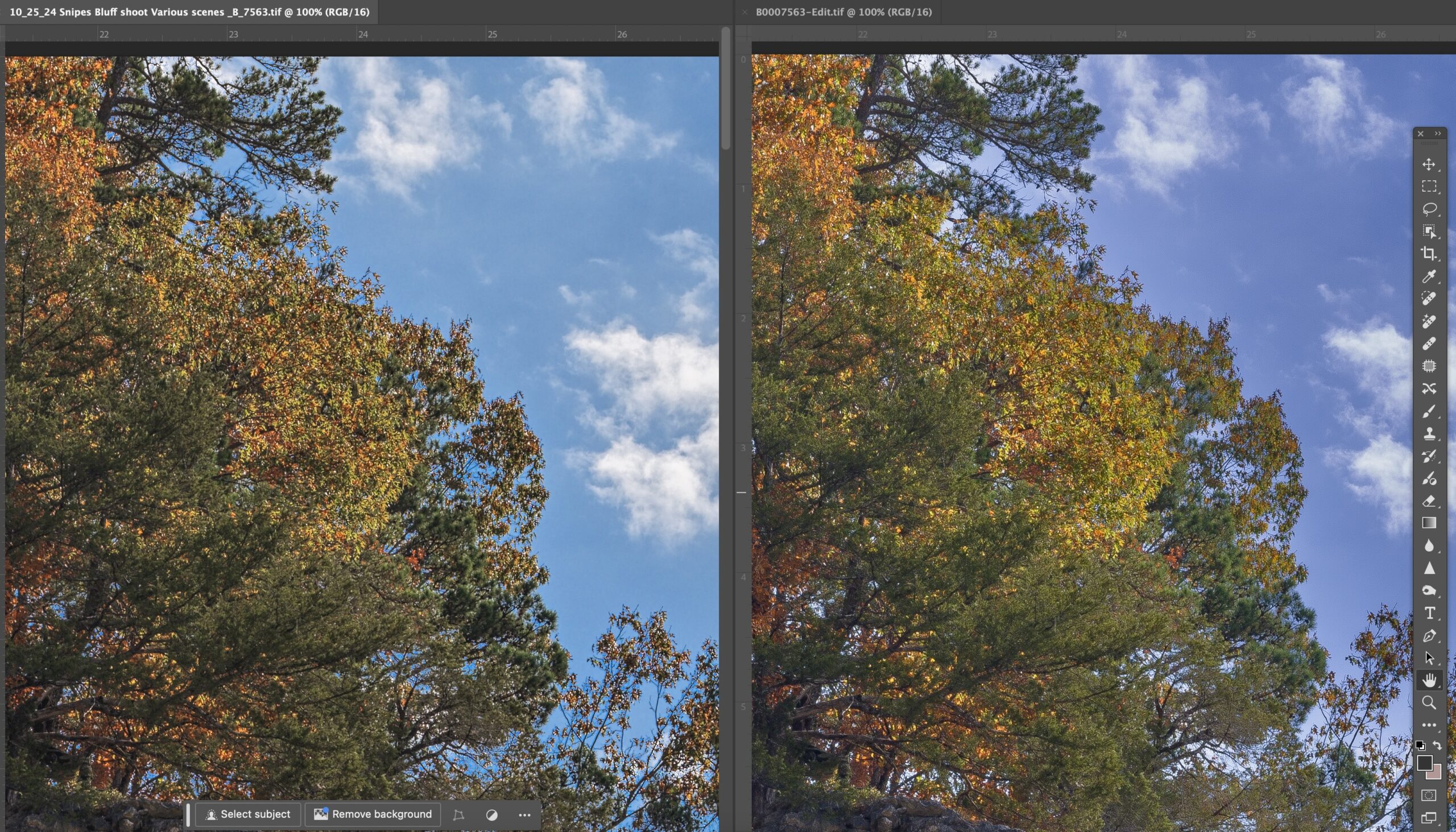
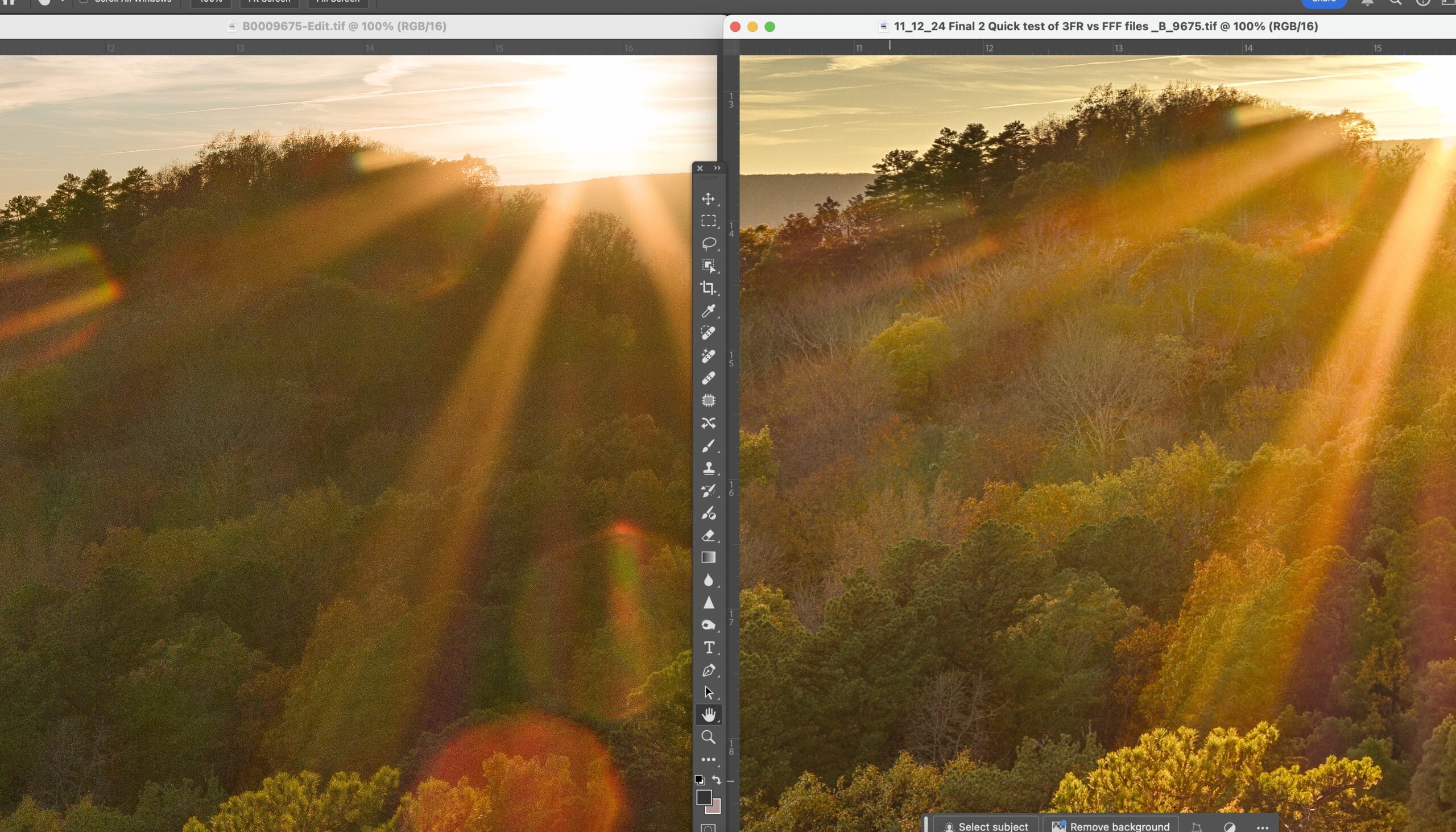
Sky comparisons between Phocus and Lightroom
The sky on this image was mixed with blue and white clouds. I noticed immediately that the Lightroom version has tended to a more red tint to the blue. Yes this can be tweaked later on, however look also at the details in the clouds themselves. They are more pronounced in the Phocus example, i.e. have more life to them. The cedar tree in the lower left has more shadow recovery in the Lightroom example. However the trees against the sky have better overall definition in the Phocus example. With Lightroom, I did use the “select sky” mask layer feature, where as in Phocus I was only able use a graduated ND filter to help along with the “recovery slider”.

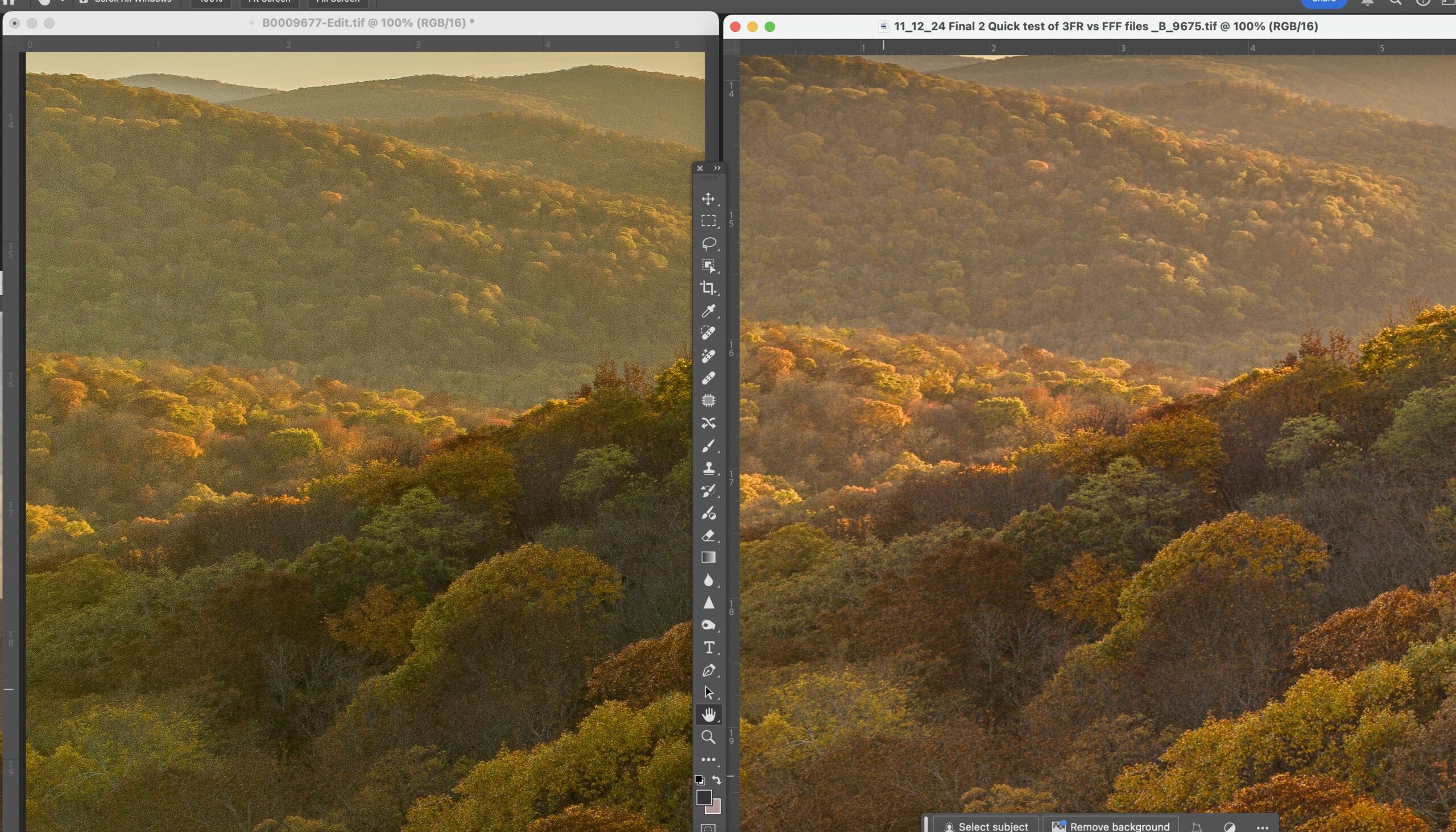
Clouds, compared from Phocus and Lightroom
The Phocus example has a much more natural look to the clouds, more separation in the graduations of the white and grey. There are a few spots where I ended up with slightly blown whites from the Phocus example, which I would fix later on in Photoshop. Also notice the trees against the horizon, clearly the Phocus example has a much better look to it. The trees towards the left edge have better shadow recovery in the Lightroom example. The most important aspect to me is the color of the clouds and this can be very hard to tweak later on. Getting a pure nature white. The darker parts of the clouds are grey whereas the darker parts of the Lightroom clouds are taking on the red tint and moving possible towards magenta.
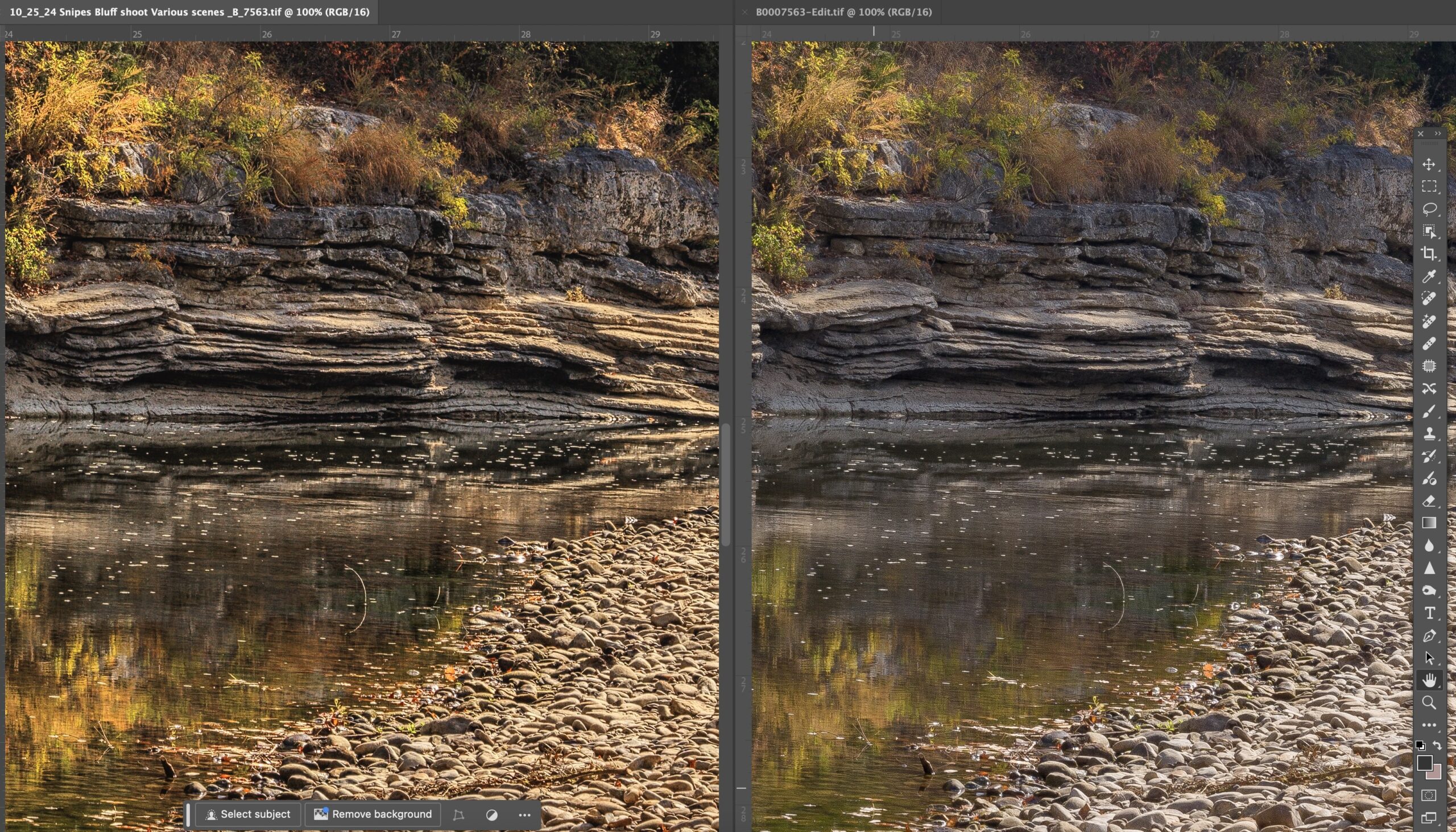
Rocks and shadows, comparisons from Phocus and Lightroom
In this case, the Lightroom conversion I feel did a better job on the rocks, lower right corner. The rest of the image seems better from Phocus. Especially the finer detail along the edges of the rock ledges. Look in the center for the brown plant growing on the top ledge. Also the reflections on the water are much more pronounced from Phocus and the details of the river bottom.
Obviously from looking at all of the images, you can see slight differences between the conversions. I feel that I am giving the Lightroom files more than enough work to get as close to the Phocus output as possible. NOTE, Phocus has by far the WORSE workflow of any raw conversion software I have used in the past 20 years. The program is slow, tedious, and has limited tools, like masking. The available mask drawing tool i.e. brush is terrible and there is no ability to “select sky” which is a huge advantage in Lightroom. However I feel that if you purchased the X2D for the HNCS (Hasselblad Native Color Solution), then you still need to do some comparison on your own to see if it’s worth delving into Phocus. I feel the advantages are there enough to continue with the software.
Written for Photosofarkansas by Paul Caldwell, Please ask before using any of this article in any other form of media.
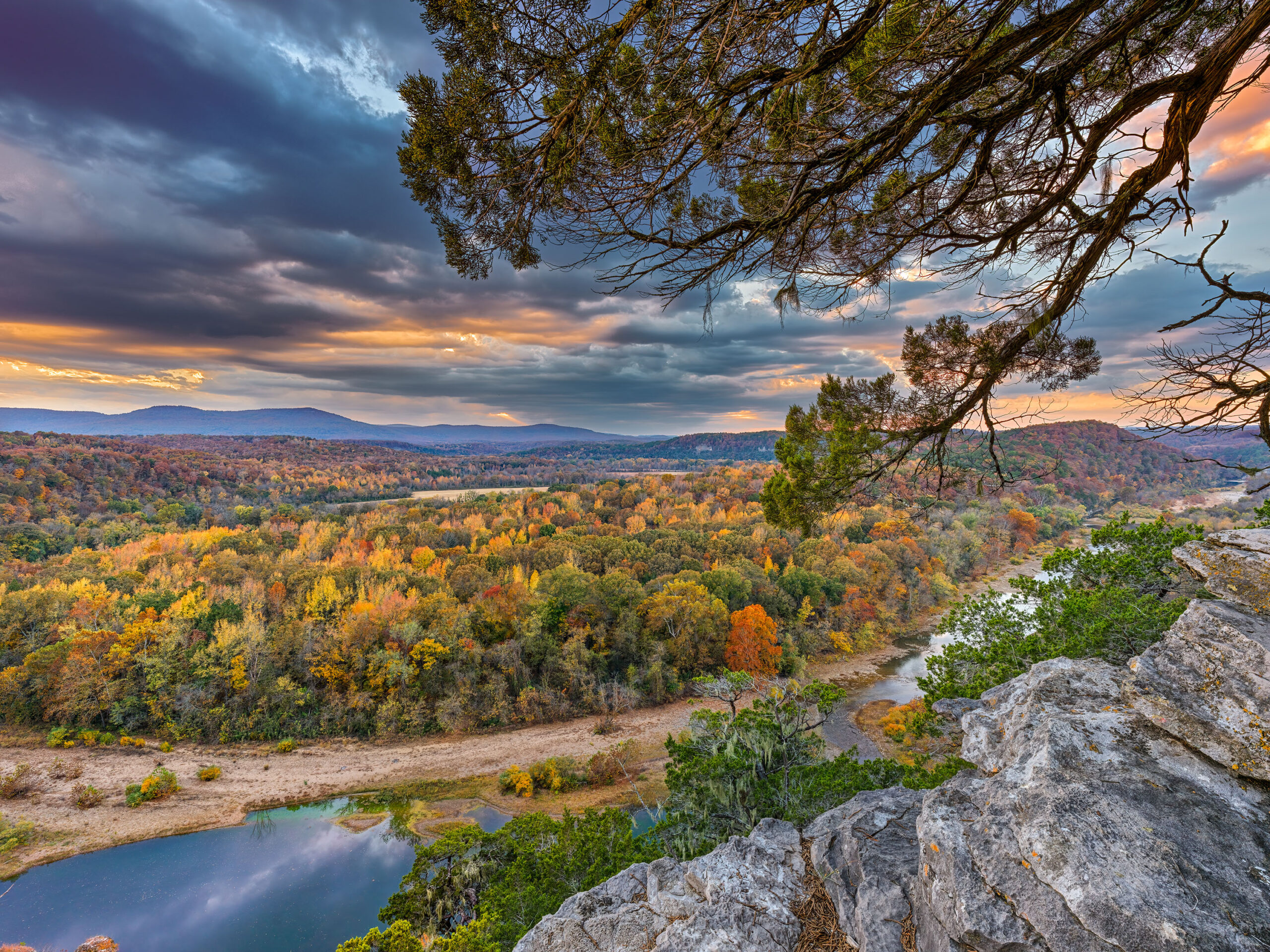
Hasselblad Phocus Color Comparison, Example Number 1
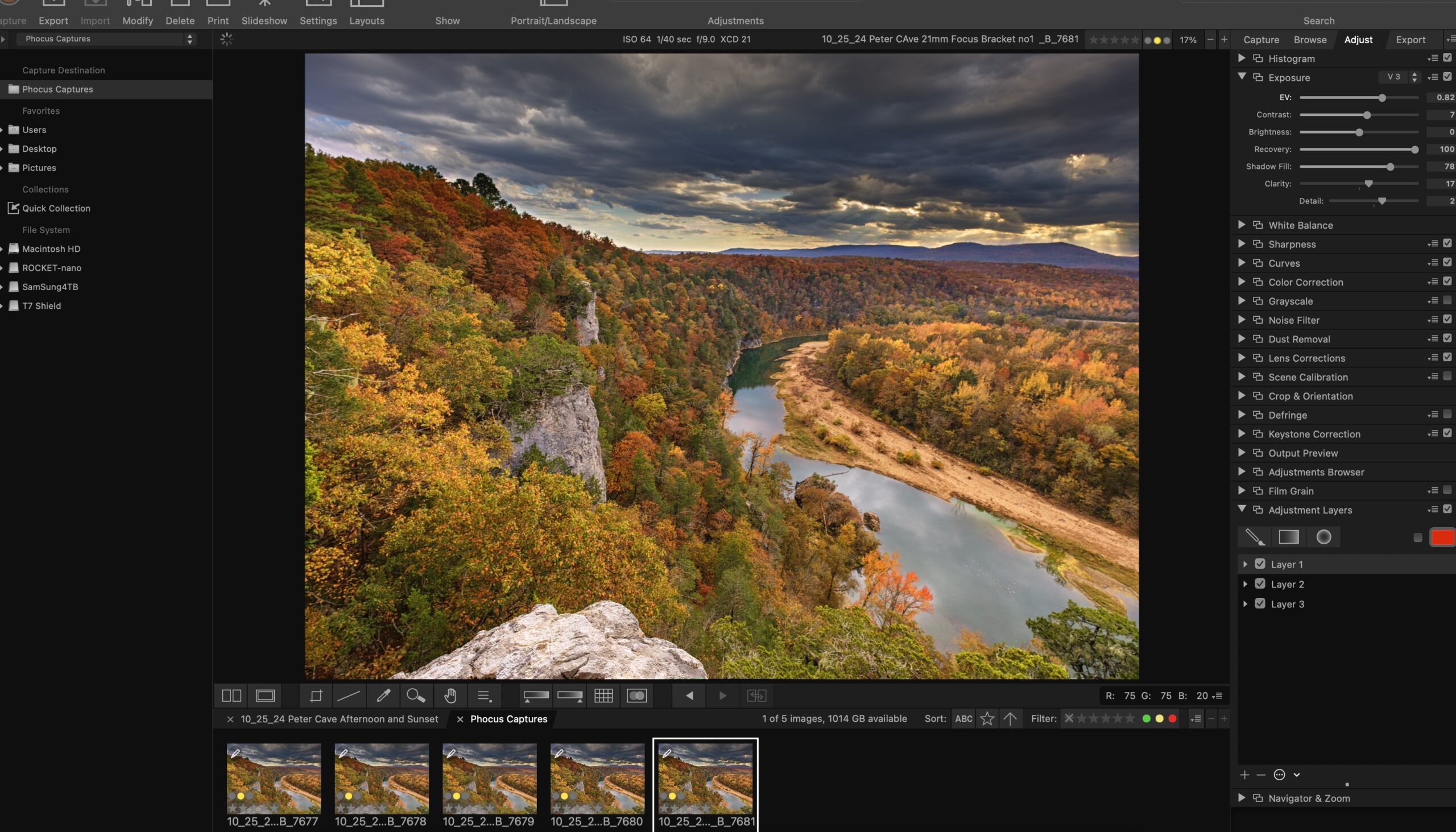
A Screenshot of Phocus Desktop for Mac Ver. 3.8.4
Hasselblad’s color or HNCS (Hasselblad Natural Color Solution), is one of the most highly touted features of the X series of cameras. From the X1D, all the way to the X2D. Before I purchased into the Hasselblad system, I had read about HNCS for years but had not given it much thought. I had used cameras from Phase One and Fuji and these seemed to give me a very nice response to color. I started working with the Hasselblad X2D in February of 2024. When I first started using the camera I immediately headed to Lightroom to work with the files. Lightroom has a modern interface, excellent toolset, and a catalog. After working with the X2D for several months, I became more interested in Hasselblad Phocus on the desktop just to see the colors and overall image response was going to be better. What I found was that in general Phocus does give a much more pleasing look to the images. However this look and feel comes at in extreme cost as Phocus Desktop (the latest version is 3.8.4) has to be the worst overall raw conversion software I have used and I have tried them all. I will write more on that later, but for the purpose of this article I want to show why it may be worth fighting the battle with Phocus as the color is truly amazing.
Hasselblad color compared to Lightroom on X2D raw
In the two images shown above, you can see the best I was able to get from Lightroom on the left and Phocus is on the right. To my eyes, the overall look of the image on the right is much more pleasing. There is much better shadow definition in both the areas on the left (trees) and the bluff on the right. The look of the sun on the black gum in the lower center is also much more effective. (note to make sure I did not get the images mixed up, I have left all of the flares in the Lightroom images). The lens used for this shot was the 20-35, which has an extremely bad response to direct sunlight generating terrible destructive flare. But more on that later.
Close up Phocus vs Lightroom Number 1 trees on left
In this close up you can clearly see that the Phocus image on the right side has much more definition in the shadows. The color response is also much better. I should note here, I am not slouch to the use of Lightroom. I do not consider myself in any way to be an expert, but I have always been able to use Lightroom to get what I feel is an excellent rendition of an image from a raw file independent of the camera.
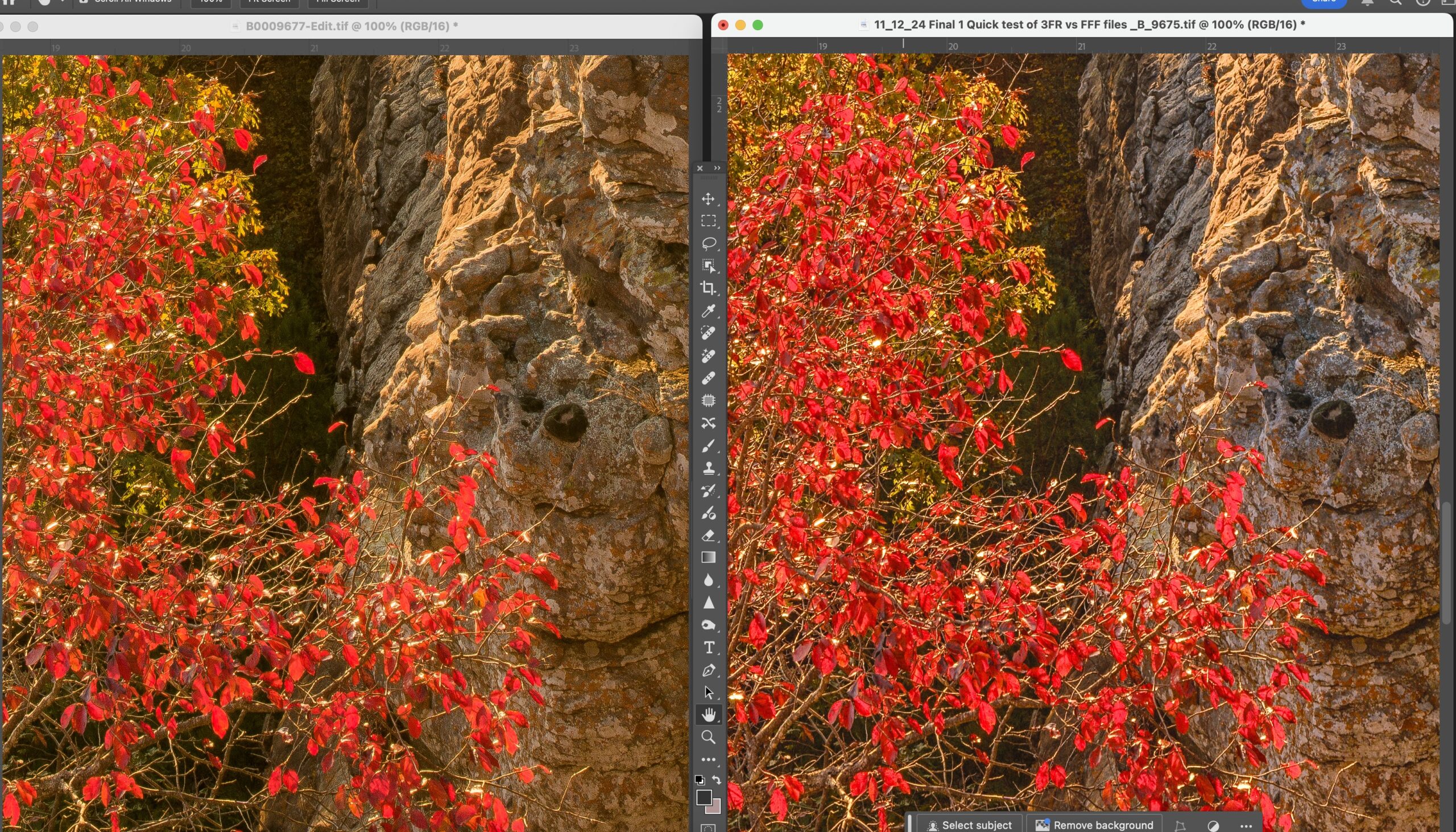
Hasselblad comparison to Lightroom on reds
In this comparison look at the reds and how much better they are defined. Also the details on the bluff appear to be better. Note the shadow area behind the red tree and you can see there are better details. When you click on the image look at the details on the bluff. There is clearly more separation on the Phocus image.
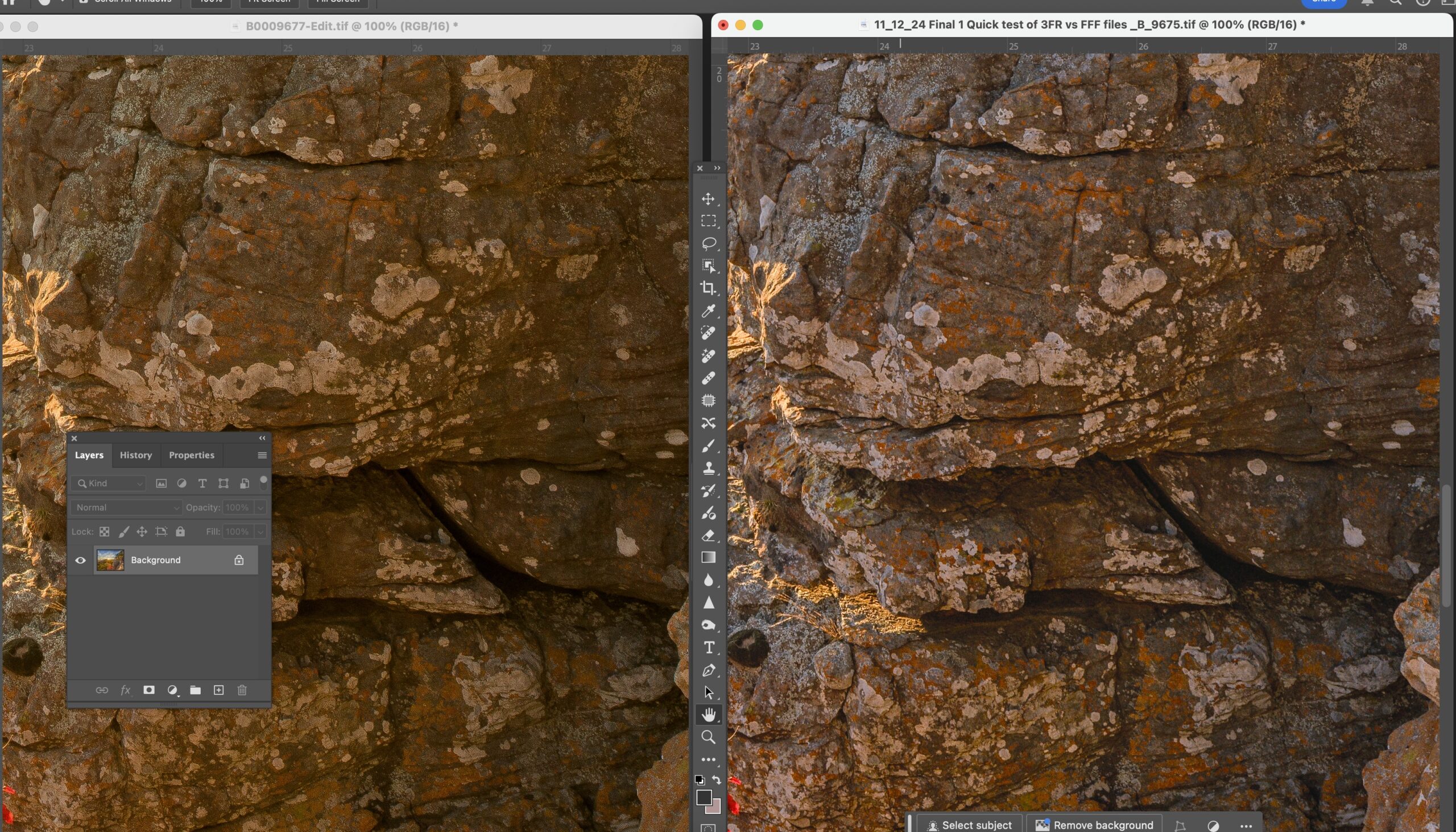
Hasselblad Phocus HNCS comparison to Lightroom
I zoomed in on the bluff to show this in more detail. The bluff is covered with all forms of fungus and lichen mainly white and orange. The white areas have better defined edges and the orange stands out better from the color of the rocks. The Phocus image is on the right.
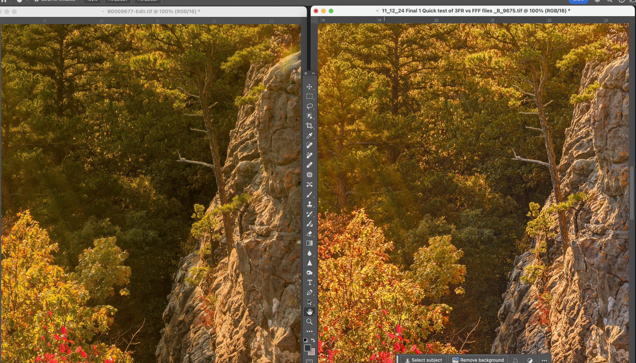
Hasselblad HNCS compared to Lightroom Camera Standard
In this side by side look at the Oak tree in the lower left and then the trees in shade behind it. Much better shadow recovery by Phocus and you can still see the light rays from the sun in the shady parts of the image. Also note the lone pine tree growing from the bluff and how it is more prominent in the Phocus example.
Hasselblad HNCS compared to Lightroom Camera Standard looking at greens
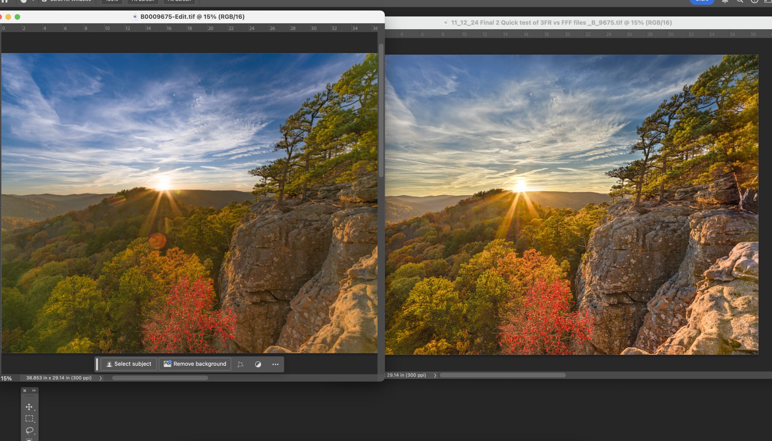
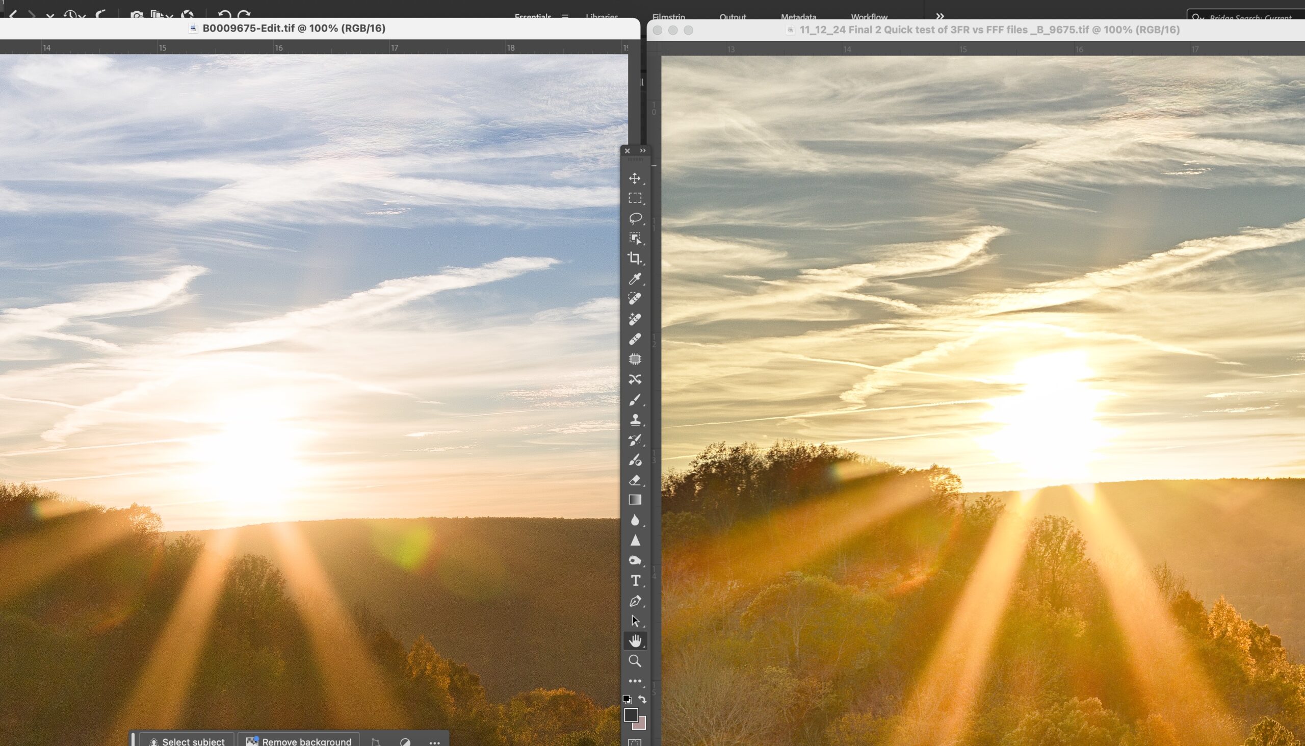
The Hasselblad 20-35 appears to have an huge flare issue when you are pointing it directly as the sun as I did to photograph this sunset. What I immediately noticed was how Lightroom (image on the left) lost a lot of the definition in the pine tree and pine needles. I realize much of this was due to the flare as it was very destructive. In masking this shot I used Lightroom’s Sky Select and it did a great job. Thus I was able to use sky select a second time, and invert it grab everything else. (THIS WOULD BE THE SINGLE GREATEST ADDITION TO PHOCUS LAYERS), in Phocus I was forced to manually draw a mask to get as much of the pine tree as I could. But even with the terrible toolset in Phocus layers, I feel that Phocus did a better job. To really see the differences please click on the image and look at it at 100%
Hasselblad HNCS compared to Lightroom Camera Standard
This image speaks for itself. The Lightroom image is on the left and no matter what I did and toolset/masking I used, I could not get the details to come out in the trees. You can clearly see that there are more visible details in the image that Phocus generated. I have removed the flare from the Phocus image using the “Generative Fill” option in Photoshop. The sky in the background above the mountain also seems to look better.
Hasselblad HNCS compared to Lightroom Camera Standard
A quick comparison to show how the details in the distance parts of the this shot came out. Shadow details appear to be better in the foreground. Also note the areas in the background. Along the bluff line you can see better details in the trees. The colors and details in the background tree line really stand out better in the Phocus images. The Phocus example is on the right.
Hasselblad HNCS compared to Lightroom Camera Standard
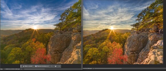
This example brings to bear some interesting differences between Phocus and Lightroom. The Phocus example is on the left and you can see again that somehow Phocus is pulling out more details in trees even though there is a huge amount of flare. The sky has a much warmer look in the Phocus image in these areas around the sun. In the Lightroom image you can see there a bit of a red tint that moves up into the white of the clouds. I also prefer the sun rays in the Phocus image.
 From the Blog
- Errors with High Resolution Mode, Panasonic LUMIX S1RII July 4, 2025
- 05/08/25 Capture One, big announcement, at least for portrait photographers May 8, 2025
- 05/03/25 Trump’s Tariffs finally start to hit Photography Equipment. May 3, 2025
- Firmware 4.1.0 for X2D? April 21, 2025
- 04/18/25–Looks like Trump’s Tariffs are much ado about NOTHING in regard to photography equipment. April 18, 2025
- 04/09/25 Arkansas Sets new standard for Scientific Ignorance with new law for Ivermectin April 4, 2025