Hasselblad Phocus Color Comparison, Example Number 1
Hasselblad’s color or HNCS (Hasselblad Natural Color Solution), is one of the most highly touted features of the X series of cameras. From the X1D, all the way to the X2D. Before I purchased into the Hasselblad system, I had read about HNCS for years but had not given it much thought. I had used cameras from Phase One and Fuji and these seemed to give me a very nice response to color. I started working with the Hasselblad X2D in February of 2024. When I first started using the camera I immediately headed to Lightroom to work with the files. Lightroom has a modern interface, excellent toolset, and a catalog. After working with the X2D for several months, I became more interested in Hasselblad Phocus on the desktop just to see the colors and overall image response was going to be better. What I found was that in general Phocus does give a much more pleasing look to the images. However this look and feel comes at in extreme cost as Phocus Desktop (the latest version is 3.8.4) has to be the worst overall raw conversion software I have used and I have tried them all. I will write more on that later, but for the purpose of this article I want to show why it may be worth fighting the battle with Phocus as the color is truly amazing.
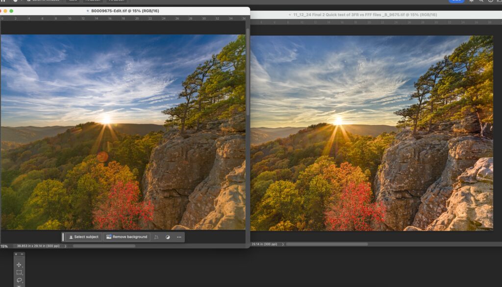
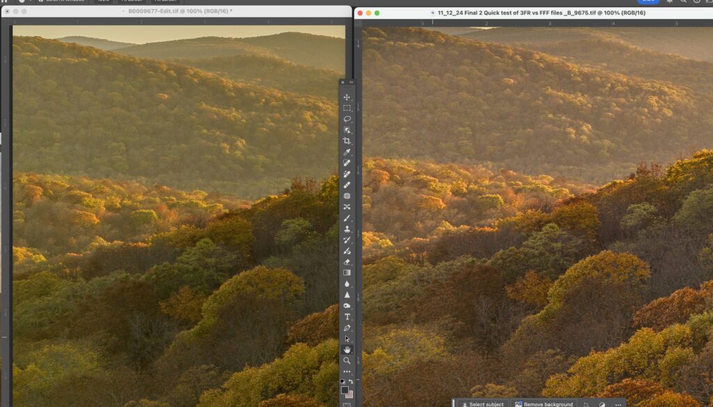
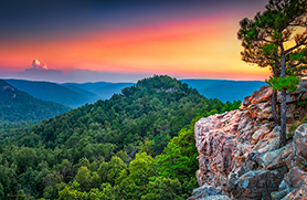
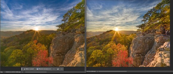
In the two images shown above, you can see the best I was able to get from Lightroom on the left and Phocus is on the right. To my eyes, the overall look of the image on the right is much more pleasing. There is much better shadow definition in both the areas on the left (trees) and the bluff on the right. The look of the sun on the black gum in the lower center is also much more effective. (note to make sure I did not get the images mixed up, I have left all of the flares in the Lightroom images). The lens used for this shot was the 20-35, which has an extremely bad response to direct sunlight generating terrible destructive flare. But more on that later.
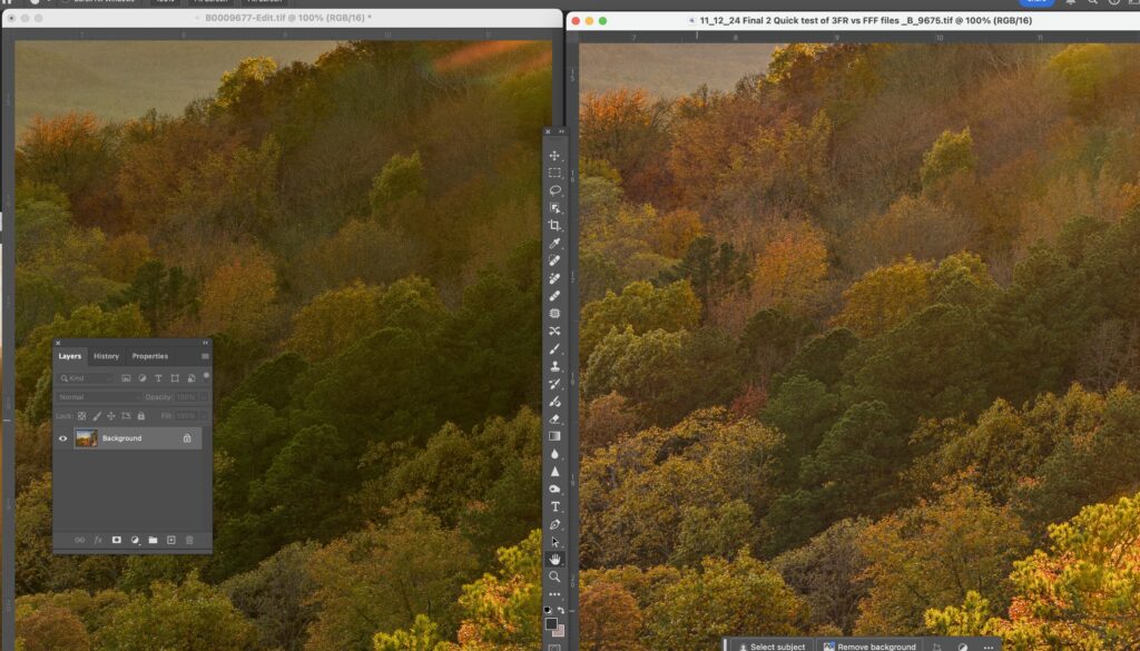
In this close up you can clearly see that the Phocus image on the right side has much more definition in the shadows. The color response is also much better. I should note here, I am not slouch to the use of Lightroom. I do not consider myself in any way to be an expert, but I have always been able to use Lightroom to get what I feel is an excellent rendition of an image from a raw file independent of the camera.
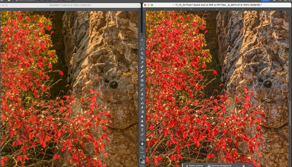
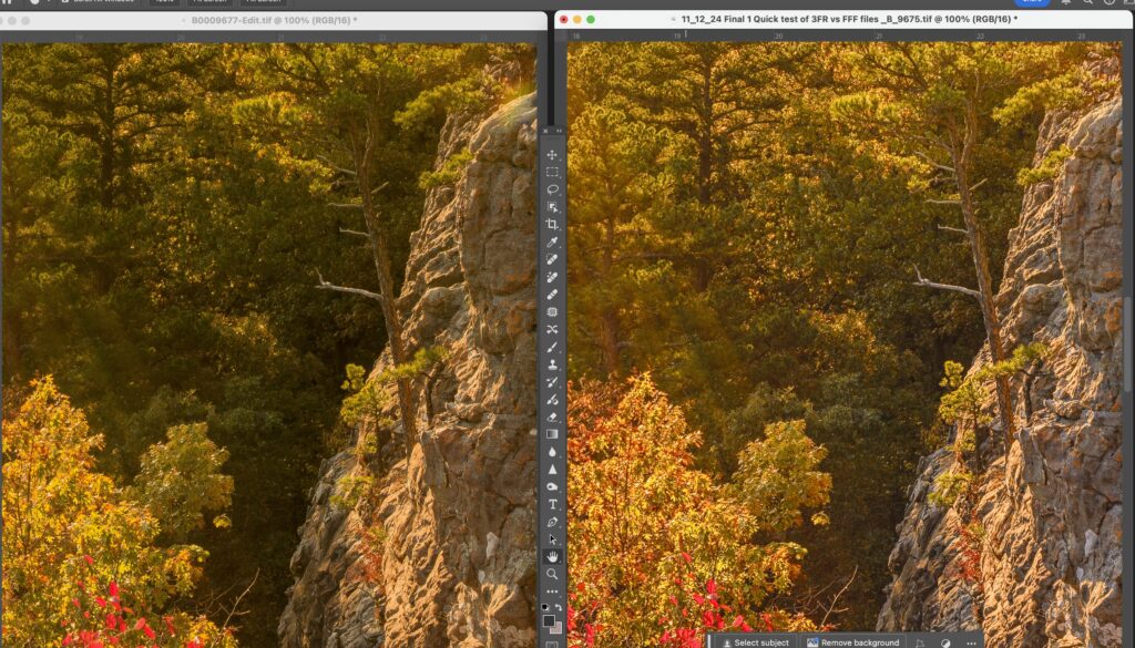
In this comparison look at the reds and how much better they are defined. Also the details on the bluff appear to be better. Note the shadow area behind the red tree and you can see there are better details. When you click on the image look at the details on the bluff. There is clearly more separation on the Phocus image.
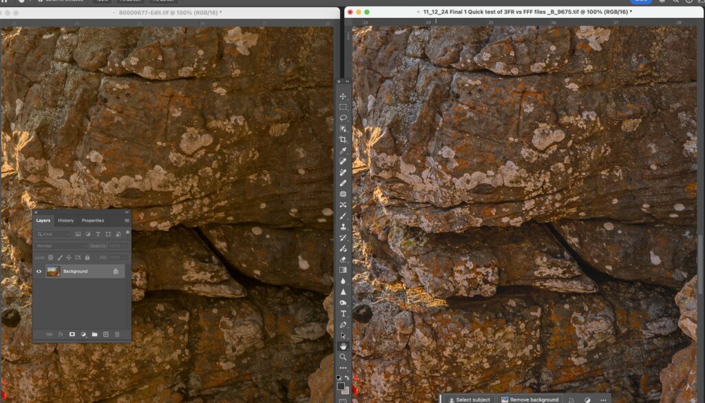
I zoomed in on the bluff to show this in more detail. The bluff is covered with all forms of fungus and lichen mainly white and orange. The white areas have better defined edges and the orange stands out better from the color of the rocks. The Phocus image is on the right.
In this side by side look at the Oak tree in the lower left and then the trees in shade behind it. Much better shadow recovery by Phocus and you can still see the light rays from the sun in the shady parts of the image. Also note the lone pine tree growing from the bluff and how it is more prominent in the Phocus example.
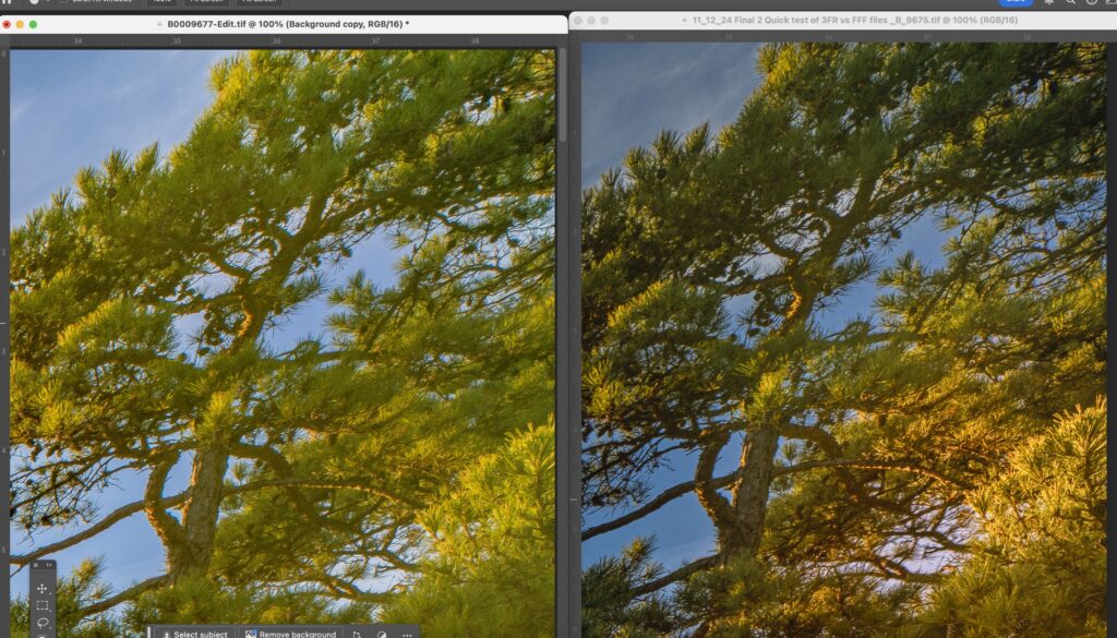
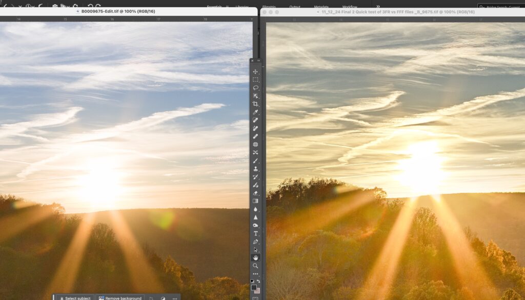
The Hasselblad 20-35 appears to have an huge flare issue when you are pointing it directly as the sun as I did to photograph this sunset. What I immediately noticed was how Lightroom (image on the left) lost a lot of the definition in the pine tree and pine needles. I realize much of this was due to the flare as it was very destructive. In masking this shot I used Lightroom’s Sky Select and it did a great job. Thus I was able to use sky select a second time, and invert it grab everything else. (THIS WOULD BE THE SINGLE GREATEST ADDITION TO PHOCUS LAYERS), in Phocus I was forced to manually draw a mask to get as much of the pine tree as I could. But even with the terrible toolset in Phocus layers, I feel that Phocus did a better job. To really see the differences please click on the image and look at it at 100%
This image speaks for itself. The Lightroom image is on the left and no matter what I did and toolset/masking I used, I could not get the details to come out in the trees. You can clearly see that there are more visible details in the image that Phocus generated. I have removed the flare from the Phocus image using the “Generative Fill” option in Photoshop. The sky in the background above the mountain also seems to look better.
A quick comparison to show how the details in the distance parts of the this shot came out. Shadow details appear to be better in the foreground. Also note the areas in the background. Along the bluff line you can see better details in the trees. The colors and details in the background tree line really stand out better in the Phocus images. The Phocus example is on the right.
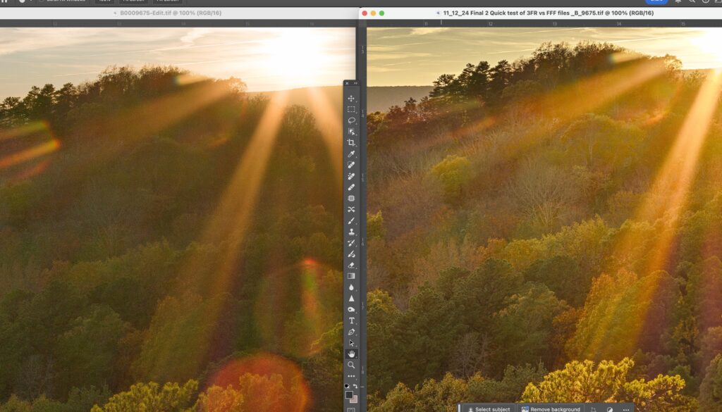
This example brings to bear some interesting differences between Phocus and Lightroom. The Phocus example is on the left and you can see again that somehow Phocus is pulling out more details in trees even though there is a huge amount of flare. The sky has a much warmer look in the Phocus image in these areas around the sun. In the Lightroom image you can see there a bit of a red tint that moves up into the white of the clouds. I also prefer the sun rays in the Phocus image.


